
Choosing the right colour for an 8×10 rug is just as important as choosing the right size. A rug of this scale has enough visual weight to affect the entire room, so its colour can shape the mood, balance, and style of the space in a major way. In 2026, homeowners are looking for rugs that do more than fill floor space. They want colours that work with their furniture, support the room’s atmosphere, and still feel current years from now.
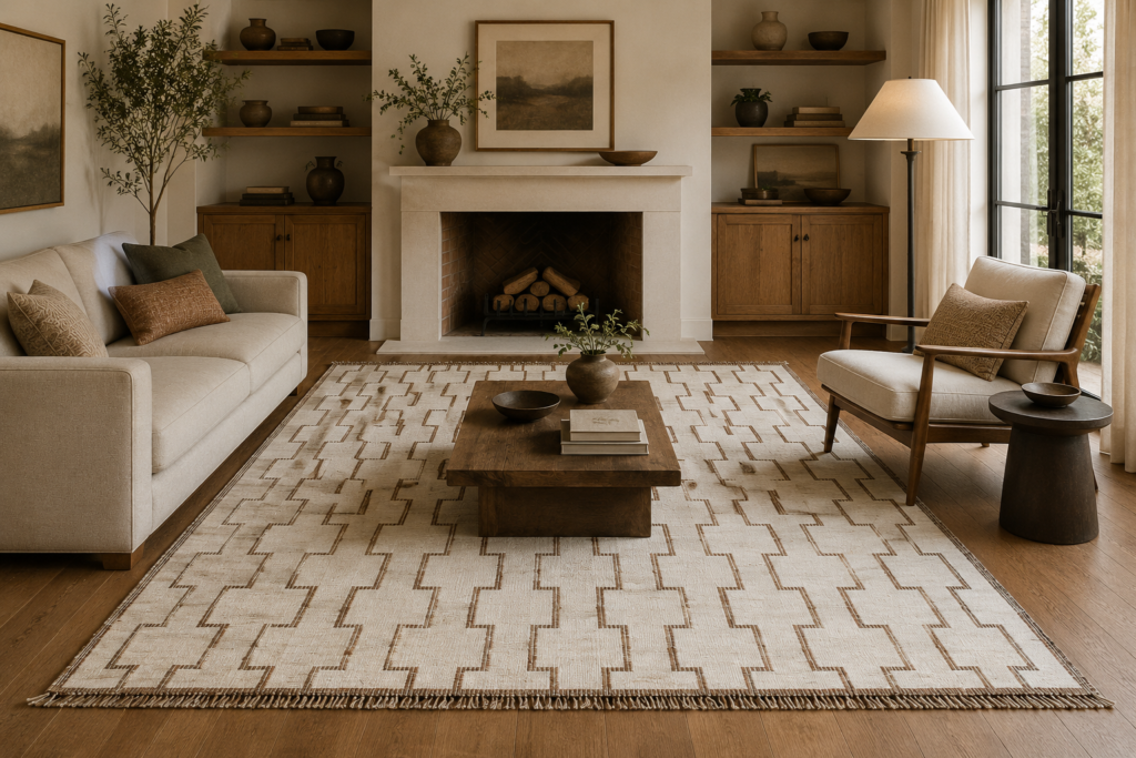
This guide will help you choose the best colour for an 8×10 rug by room type, design style, lighting condition, and lifestyle. It explains how different colours behave in real interiors, what shades are trending in 2026, and how to avoid mistakes that make a room feel disconnected or overwhelming. If you are trying to narrow down the right rug colour before buying, this article will give you a clear and practical framework.
Why Rug Colour Matters So Much
An 8×10 rug is a large design surface. Because it covers such a big part of the floor, its colour has more influence than a cushion, vase, or side table. It can make a room feel brighter, warmer, softer, deeper, or more dramatic depending on the shade you choose. That means rug colour is not just a decorative choice. It is a structural one.
A light rug can make a room feel open and airy. A dark rug can make it feel grounded and intimate. A neutral rug can bring calm and flexibility, while a coloured rug can add character and energy. Since the 8×10 size is used in main rooms like living rooms, bedrooms, and dining rooms, the colour decision becomes even more important.
Many people make the mistake of choosing a rug colour in isolation. They look at the rug alone and decide they love it, without thinking about the walls, floor, sofa, lighting, or overall mood of the room. But the rug has to work as part of the whole interior. The right colour makes the entire room feel more complete.
Warm Neutrals Are Leading In 2026
One of the strongest rug colour directions in 2026 is warm neutrals. Shades like beige, oatmeal, sand, taupe, cream, mushroom, and soft stone are becoming more popular because they feel calm, timeless, and easy to live with. These colours are especially effective in an 8×10 rug because they provide a large, stable background without dominating the room.
Warm neutrals are appealing because they support many styles. They work in modern homes, classic homes, transitional interiors, and relaxed family spaces. They pair well with wood furniture, linen upholstery, metal accents, and natural textures. That flexibility makes them one of the safest and smartest options for a long-term rug investment.
They are also easier to style over time. If you change your sofa cushions, curtains, or wall art later, a warm neutral rug is more likely to keep working with the new palette. For people who want a rug that will stay useful even if the room evolves, this category is extremely strong.
Cool Neutrals Still Have A Place
Although warm colours are leading in 2026, cool neutrals are not gone. Grey, slate, silver, and soft blue-grey rugs still work beautifully in certain rooms. They are especially effective in spaces that already have cool-toned walls, dark flooring, or modern minimalist furniture.
A cool neutral 8×10 rug can create a clean, polished look. It is often useful in home offices, formal living rooms, or rooms with a lot of white and black contrast. The key is to make sure the room does not become too cold or sterile. If the rug is cool in tone, it helps to balance it with warmer accessories, wood details, or softer fabrics.
Cool neutrals are best when the goal is restraint. They do not scream for attention, but they can create a sharp and tidy visual base. If you want the room to feel elegant, crisp, and uncluttered, they remain a solid option.
Earthy Colours Are Rising Fast
Earthy colours are one of the most important trends in rug design right now. Clay, rust, terracotta, olive, muted green, brown, and dusty natural tones are all becoming more common in 8×10 rugs. These colours feel grounded and connected to nature, which is why they are so popular in homes that aim for warmth and comfort.
The beauty of earthy tones is that they bring personality without feeling overly loud. A rug in rust or olive can create a strong mood, but still feel lived-in and approachable. That makes these colours ideal for living rooms and bedrooms where the space should feel calm but not bland.
Earthy rugs also work well with current interior styles that use organic textures, curved furniture, handcrafted pieces, and layered materials. In an 8×10 size, these tones feel substantial and sophisticated, not just trendy.
Beige Is Not Boring When Done Well
Beige has had periods where people considered it too plain, but in 2026 it is being re-evaluated in a much more positive way. The right beige rug can be incredibly elegant, especially when it has texture, variation, or subtle tonal depth.
The mistake people make with beige is thinking it must be flat or lifeless. In reality, a well-made beige 8×10 rug can have beautiful dimension. It can include undertones of cream, warm grey, stone, or sand that change slightly in different light. This gives the room softness and complexity without looking busy.
Beige is especially strong in bedrooms and living rooms where the goal is relaxation. It creates a gentle backdrop that lets the furniture and decor breathe. If you want a rug that feels luxurious without making a loud statement, a layered beige tone may be the perfect choice.
White And Ivory Bring Light, But Need Care
White and ivory rugs remain attractive because they make a room feel brighter and more open. In rooms that are dark or small, an ivory 8×10 rug can instantly add airiness. It reflects light and gives the interior a fresh, clean feeling.
However, white and ivory rugs are not ideal for every home. They can show stains, dirt, and wear more easily than deeper tones. In a family home, a pure white rug may become stressful rather than enjoyable. That is why many people prefer off-white, ivory, or creamy neutral shades instead of a stark bright white.
These slightly softened shades still offer brightness but are easier to live with. They work especially well in bedrooms, formal living areas, and calm interiors with limited traffic. If you want lightness without harshness, ivory is usually the better choice.
Dark Colours Create Depth And Drama
Dark rugs can completely change the mood of a room. Deep charcoal, navy, chocolate brown, forest green, and inky black tones create visual weight and a sense of sophistication. In an 8×10 size, these colours can make a room feel grounded, polished, and more dramatic.
Dark rugs work especially well in large spaces or rooms with plenty of natural light. They can help anchor furniture and make lighter walls and upholstery stand out more clearly. They are also practical in some homes because they hide stains and daily wear better than lighter rugs.
The key is balance. A dark rug can make a room feel heavy if everything else is also dark. To avoid that, pair it with lighter walls, soft lighting, or furniture in lighter or warmer tones. When used thoughtfully, dark rug colours can feel incredibly rich and stylish.
Blue Remains A Trusted Favorite
Blue continues to be one of the most reliable rug colours because it feels calm, clean, and versatile. Lighter blues can create a breezy, relaxed look, while deeper blues add depth and refinement. In 2026, muted blue, denim blue, slate blue, and dusty navy are especially strong for 8×10 rugs.
Blue works in many settings. In living rooms, it can feel elegant and serene. In bedrooms, it creates a restful mood. In dining rooms, a deeper blue can add sophistication without becoming too formal.
One of the reasons blue remains so popular is that it works with so many other colours. It pairs well with beige, white, grey, wood tones, brass, and even muted green. That makes it one of the easiest colours to live with if you want flexibility.
Green Is The Color Of Calm And Balance
Green rugs are also gaining popularity in 2026 because they connect beautifully with natural interiors. Sage, olive, moss, and muted forest tones all bring a feeling of calm and freshness. An 8×10 rug in green can make a room feel restful without being bland.
Green works particularly well in spaces that already use wood, linen, rattan, stone, or other natural materials. It also pairs beautifully with cream, taupe, clay, and warm neutral furniture. In bedrooms and living rooms, green can create a very balanced atmosphere.
Soft green rugs are especially appealing if you want colour but do not want anything too bold. They provide a gentle accent while still feeling sophisticated and current.
Rust And Terracotta Bring Warmth
Rust and terracotta tones are strong in 2026 because they add warmth instantly. These colours feel earthy, rich, and full of character. An 8×10 rug in this palette can make a room feel cozy and lived-in, especially when combined with natural materials and warm lighting.
These colours are useful in rooms that need more energy or personality. They are excellent for eclectic interiors, boho settings, Mediterranean-inspired rooms, and spaces that need a little extra depth.
The key is to use them in balance. Rust and terracotta can become very dramatic if surrounded by too many other strong tones. But when paired with soft creams, browns, or muted greens, they feel inviting and elegant.
Pattern And Colour Should Work Together
Colour is not only about the base tone of the rug. Pattern changes how colour appears too. A neutral rug with a subtle pattern can feel very different from a flat neutral rug because the pattern adds depth and visual movement.
If a room is already busy, a rug with soft colour variation may be better than a bold printed one. If the room is simple, a stronger pattern can create interest and energy. The important thing is to understand how colour and pattern interact.
A patterned 8×10 rug often hides wear better than a solid one. That is one reason many families prefer slightly textured or patterned rugs in living rooms and dining areas. The variation helps the rug age more gracefully.
How Light Changes Rug Colour
Lighting can completely change the way an 8×10 rug looks in your home. Natural daylight may make a beige rug look lighter and warmer, while evening lighting may make the same rug feel deeper and richer. A blue rug can appear brighter in daylight and more muted at night.
That means you should never choose rug colour only by looking at product photos. You need to imagine how the rug will behave in the actual room. South-facing rooms tend to bring out warmth, while low-light spaces often make colours feel darker.
If the room gets a lot of bright natural light, you can usually handle more saturation or contrast. If it is darker, softer and lighter tones often work better. Thinking about lighting early helps you avoid surprises after the rug arrives.
Matching Rug Colour To Flooring
The floor colour beneath the rug matters more than people realize. A rug should complement the floor rather than disappear into it or fight against it. If you have light wood floors, a slightly deeper rug can create contrast and definition. If your floors are dark, a medium or light rug can help brighten the room.
Matching too closely can make the rug visually vanish. Too much contrast without any harmony can make the room feel choppy. The best result usually comes from a shade that creates gentle contrast while still belonging to the overall palette.
For example, a warm beige rug can look beautiful on medium wood floors, while a muted blue or olive rug may bring just enough contrast to keep the room interesting. The floor and rug should support one another, not compete.
Matching Rug Colour To Furniture
Furniture colour also affects what rug shade will work best. If your sofa or bed is very neutral, the rug can introduce more colour or pattern. If the furniture is already bold, a quieter rug often creates better balance.
A common mistake is choosing a rug that disappears because it is too close in tone to the furniture and the floor. Another mistake is choosing something too strong when the furniture already dominates the room. The rug should create harmony, not more noise.
The easiest way to think about it is this: the rug should either complement the furniture or gently contrast it. It should not feel unrelated. The more intentional the colour relationship, the more polished the room will look.
Best Rug Colours For Living Rooms
Living rooms often work best with rugs that feel grounded and flexible. Warm neutrals are excellent here because they support changing cushions, throws, and decor. Muted blues and greens also work very well because they create calm and help the room feel relaxed.
If your living room gets a lot of traffic, a slightly darker or patterned rug may be more practical than a light solid one. This helps hide wear and makes the room look fresh for longer.
If the goal is a softer and brighter living room, ivory, beige, and sand tones are often ideal. If the goal is a more luxurious and moody living room, deeper tones like navy, olive, charcoal, or rust may work better.
Best Rug Colours For Bedrooms
Bedrooms usually benefit from calm and restful rug colours. Soft beige, ivory, taupe, muted blue, sage, and gentle grey are all strong options. These shades help the room feel peaceful and comfortable, which is exactly what a bedroom should do.
If the bedroom has a lot of sunlight, you can safely use a slightly richer tone without making the room feel heavy. If the room is darker, lighter or softer shades will help open it up.
A bedroom rug should support relaxation, so overly bright or high-contrast colours often feel too energetic. The best bedroom rugs usually have a quiet, soothing presence.
Best Rug Colours For Dining Rooms
Dining rooms need colours that are practical and polished. Medium tones, subtle patterns, earthy colours, and darker neutrals often work very well because they hide minor stains and do not feel too delicate.
Deep blue, charcoal, olive, and warm taupe are all useful in this setting. If the dining room gets a lot of use, a patterned rug can be especially smart because it disguises crumbs or light marks better than a solid light rug.
The rug should feel elegant but not fragile. Dining rooms are functional spaces, so the colour should support both style and practicality.
Best Rug Colours For Offices
Home offices usually work best with calm, controlled colours. Soft grey, warm beige, muted blue, and light earthy tones can help the room feel professional and focused.
If you want the office to feel more polished and less temporary, a rug with subtle depth or texture is ideal. The colour should not be too distracting, because that can compete with the work function of the room.
A good office rug colour supports concentration while still making the room feel more comfortable than a bare floor would.
How To Choose A Timeless Colour
If your goal is longevity, the best rug colour is usually the one that sits just slightly away from the trend extremes. Very loud colours can feel exciting at first but may become limiting later. Very bland colours may not give the room enough character.
Timeless rug colours usually live in the middle. Warm beige, soft ivory, muted blue-grey, olive, taupe, and earth tones are all strong because they feel current without being overly tied to one design moment.
If you want a rug that will last through changing furniture, changing wall paint, and changing moods, look for a colour that is grounded, adaptable, and not too sharp.
How To Choose A Bold Colour
Sometimes a bold colour is exactly the right choice. If the room is too plain, a stronger rug can create focus and energy. Deep blue, emerald green, rust, terracotta, or rich charcoal can all become powerful design features in an 8×10 size.
The key is to make sure the room can support the boldness. If the furniture and walls are already busy, a bold rug can push the space too far. But if the room is simple, the rug can provide the personality it needs.
Bold colours work best when they are repeated in smaller ways elsewhere in the room. That might mean cushions, art, a throw, or accessories. Repetition makes the room feel cohesive.
What To Do If You Are Unsure
If you are not sure which colour to choose, start with the room’s biggest and most permanent elements. Look at the floor, sofa, bed, or table. Then ask whether you want the rug to blend in, contrast gently, or become the main feature.
For most people, a warm neutral or muted earthy tone is the safest choice. These colours work in many rooms, and they are easier to decorate around later. If you want colour but are nervous about commitment, a soft blue or green is often a good middle ground.
The right rug colour is the one that makes the room feel balanced and comfortable every day, not just on the day it arrives.nal Thoughts
The colour of an 8×10 rug can completely change a room, which is why it deserves careful thought. In 2026, warm neutrals, earthy tones, muted blues, soft greens, and balanced dark shades are among the most effective and stylish choices. They work because they are flexible, calming, and easy to live with.
The most important thing is to match the rug colour to the room’s mood, lighting, flooring, and furniture. A rug should support the space, not fight against it. When the colour is right, the entire room feels more unified and more finished.
If you choose carefully, your 8×10 rug will do much more than cover the floor. It will become one of the strongest design elements in the room.